Tuesday, March 29, 2022
Sunday, March 27, 2022
How does my movie challenge or use conventions and how does it represent social groups?
Click here to view the accessible version of this interactive content
Click here to view the accessible version of this interactive content
Click here to view the accessible version of this interactive content
Click here to view the accessible version of this interactive content
Click here to view the accessible version of this interactive content
Click here to view the accessible version of this interactive content
Thursday, March 24, 2022
How does my product engage with audiences and how would it be distributed as a real media text
How does my product engage with audiences?
Narrative
My films narrative is not handed to the audience so easily, there are enigmas that my audience must crack. My audience specifically will enjoy this and feel fulfilled by a challenge, audiences like for example 'hey days' would not so much like my film as my film cannot help them relax as my film makes you think. My film does not have thrilling and terrifying action sequences that make your adrenaline pump but instead offers something deeper helping the audience think about what they think the reality is.
Exploring fears
I feel that my film could connect through fear to many people, even those who do not want to look at a film about mental struggles. this is because these days with the rise in technology and surveillance I would say most people whether they would like to admit it or not have a fear of being watched all the time and being studied and looked at, that could be from the data on their phone or the camera on their laptop or the cctvs everywhere at this point I think this is a societal fear. This really correlates to David J. Skals theory that people find films scary that draw on societies fears.
ideology
My films ideology really brings mens mental health to the forefront because representationally men are not normally shown as weak how my main character Casey is in this film. this film could show people the mental struggles of men can go unnoticed by society and how societies views on mental health make some feel alienated. The joker 2019 showed Mens mental health although I feel including violence and alluding to mental illness even though I think the film is great I think was a morally poor decision by the writer so I when making my film that scratches on the topics of mental health I was careful to not include violence or crime from Casey. Furthermore, my audience will be able to connect with this ideology in my film as young people these days are really interested in the topic of mental wellbeing.
representation
For representation within my film we have unconventional representation of men and mental health and other then that we have representation of society as a whole. Society in my film is presented as daunting and unapproachable, this will engage lots of my audience as most people at one point or another in their life have experienced nervousness around people and crowds so this could really connect with those people.
tone
My film starts off with shots that show the city as mundane, as the opening progresses we start to see more dark and distressing imagery I think this is what connotes this idea that things might seem like normal life but for some people in their minds things mundane as that are actually really scare and maybe they should be for everybody. Maybe mundane life behind the walls is actually really dark.
style
My films stylistically is not so conventional of a psycho - thriller because of the high key outdoor yellow lighting and the square framing. My film in terms of style is similar to that of Taxi Driver by Martin Scorsese 1976.

what does a film distributor do?
A distributor is responsible for the marketing of a film, they organise how the film will be advertised and where it will be shown and in what formats.
examples of distributors
Film4 productions:
- this is England 2006
- the lobster 2015
- the favourite 2018
Sony:

- spider man 1978
- venom 2018
- mall cop 2009
pixar:
- monsters inc 2001
- toy story 1995
- bugs life 1998

I feel that my film would work amazingly distributed by a company like Focus features because of its unconventional aspect ratio and that is a Psychological thriller that does not offer escapism which most likely means that the film would not be distributed so effectively by a distributer like Universal.


this film is (Last Night, In Soho 2021) which is an example of a Psycho-thriller film distributed by Focus features and this is a great example of a film that would have a slightly more specific audience as the average person may only go once a month or two months so they will not take the time to see a film like this and would much rather go to the big block busters like Spiderman.
Theme wise this film is similar to mine due to the psychological aspects of questioning reality.

dvd's were also made for this film, I think this is effective for film like theirs or mine because an audience who is more passionately interested in cinema may want to collect films in a physical format to keep possibly for their collection, specifically in the case of last night in soho which is half based in the 60's this could be nice to keep with that theme.
I would like to distribute DVD's of my film and posters and newspapers as this will attract a more passionate audience.
My DVD

Here is the DVD I designed for my film, I have kept it quite simple as I want the audience to want too see more. further more this works well with my film as it creates an Enigma of ''what is this about?''
however it also does hint at a thriller due to the city scape and the timeless title, it gives an almost dystopian look.
Wednesday, March 23, 2022
Seb's top trump
Before Coursework: After:


I love to take photographs and when looking back at my old photos this one inspired me to film in a city because there is something daunting about it.
I would say what primarily what forced me to improve my organization skills this year is my choice of location, due to filming in the city and not at school I couldn't film after school. this meant I had to get my actors and equipment all together in one place on weekends, at times this was difficult but I do feel it has improved my skills in the area of organization. Last year when I ended up with my finished project and really felt that my film did not look as good as it could have, after reflection I realized this was because I used minimal equipment, so this year I've decided to make a conscious effort to use as much equipment as I can. My decision to use a Gimble and a snorricam really taught me a lot about film making and overall improved my Camerawork, using these tools showed me how to film new shots like for example I learnt how to film a snorricam shot which communicated that my main character ''Casey'' is terrified of people, without learning how to do this my film will not have been as successful.

Sadly I feel my editing and VFX skills did not improve this year as I did not try any new editing techniques from last year, I chose to use conventional continuity editing so did not have the opportunity to try something new for example something like a graphic match. I do think my film warranted VFX but it is something I should try next time, I used simple text in my film as I was inspired by a more simple and timeless style of opening titles of a psycho thriller.

My creative confidence has 100 percent changed this year because I was able to fully be in control of all decisions, last year we chose a storyline. This year I came up with my own story and all ideas came from my brain, obviously with help from inspirations.
All together I am very proud of This work.
Tuesday, March 22, 2022
How did I intergrate technologies technologies in my film?
How did I integrate technologies technologies in my film?

Research:
My research took place mainly through watching films and then clips from films on YouTube to analyse and help me to understand conventions/iconography and themes within psychological thrillers. to watch these films I used software Netflix, Disney plus and mubi. 
I made my story board by drawing it, I then used my Sony A6000 to take a picture of all the drawings and upload them to my blog. By doing this I used both an analog process and a digital one to make my storyboard. being able to integrate technologies really helped me to fulfill how I wanted my storyboard to be because I wanted the freedom of hand drawing but also I obviously had to be able to digitalize it.
to emphasise sounds in my film I had to record it in post of a piece of hardware called a zoom mic and then upload it to the software Final Cut Pro.
Planning:
For my planning I used photography to document possible locations, and padlet to make a moodboard for my film.

I made my story board by drawing it, I then used my Sony A6000 to take a picture of all the drawings and upload them to my blog. By doing this I used both an analog process and a digital one to make my storyboard. being able to integrate technologies really helped me to fulfill how I wanted my storyboard to be because I wanted the freedom of hand drawing but also I obviously had to be able to digitalize it.
I have never done a snorricam shot, to make this effect I had to use the hardware of the snorricam device and then after recording I used the SD card to the DDP and then into my film.
To get my desired font for my film I was able to find it on a website called 'what the font' I then downloaded it to my computer onto Final Cut Pro to use for my credits.
Monday, March 21, 2022
finalising edit
today I have been resolving issues with my narrative clarity by adding in some unused footage to make clear that my man in the suit my main character meets is a figment of his imagination. But Im also planning to add some filters as I feel it's still not completely developed.


Today I added in my font and I really think my film looks more visually appealing now.

Why I used the 4:3 aspect ratio

In my film I have made the decision to make the template of my frame a 4:3 aspect ratio, I have done this to establish an idea of my characters seeming trapped. this effect is created because we are used to seeing a more panoramic frame so when it is square it is uncomfortable and it makes the charecter seem boxed into a world they perceive as scary. It also visually communicates my psychological aspect and possibly helps the viewer to understand how Casey feels. I have also done this because my choice to use leading lines and symmetry in my film to suggest something is off about my characters and this world looks better with square format in my opinion.
the lighthouse, 2019

the lighthouse is a psychological thriller that uses square format and I feel the battles the characters experience in their mind are represented amazingly through this choice of aspect ratio by the director Robert Eggers, Winslow is going through torment in his mind and at the end he drinks excessively and tries to kill his coworker to try and get out of it but he cannot.
Sunday, March 20, 2022
Profiling target audience

Here you can see that this website has told us that metroculturals tend to be left leaning people, their exposure to culture means they are more aware of social issues.

these people tend to be quite well educated, this could have allowed them to be exposed to more culture. furthermore they have reasonable amounts of disposable income which allow them to be more free to more frequently visit cinemas and galleries and be interested in a more deep film
I feel my audience would be metrocultural as a psycho thriller normally attracts more of that audience as they have an interest in culture and don't just go to see the blockbusters as they normally have more disposable income so don't crave as much escapism.

Metroculturals are mostly younger singles and some older singles, which show that although they love to partake in many activities they also enjoy significant alone time.

this here shows that metro culturals most commonly live in flats which supports the idea that they are city people, they loves cities as they are able to fully immerse themselves in culture.

Metro culturals tend to be creatives themselves this may be why they are more aware of the art and film in their area, and visit it more frequently.

this here shows us how metroculturals engage in culture very frequently weather that be the arts or Gallerys.

Metroculturals believe in the importance of access to museums and galleries and also appreciate art in their local area.

This is a Psycho thriller called "we need to talk about kevin" 2011
here is some information that can help to tell me about the possibilities of who my audience is, first off we can see that the more common gender to watch this films is women and this could be because women are more interested by psychological things, the most common age is also under 35 so this shows young people are more accepting to films like this then older people.
Audience profile:
After doing some research which can be seen above, films like psychological thrillers tend to have a slightly higher numbers of female viewers, as for age the resource audience finder says that it is a fifty fifty split between young singles and older singles however pearl and dean says that Psycho thrillers are most popular in younger audience which in my opinion makes more sense as young people tend to be accepting of a darker themed film. furthermore these viewers are more commonly high ABC1 social class this means ultimately they are more financially stable which means they do not look for escapism in film but education.
after this research ive found that the metro cultural is the right audience for my film.
Bella:
Bella is a recent graduate from university of the arts london who studied art history, whilst studying there she made contact with an artist who she now assists, this job pays very well and allows bella the time to visit the cinema and gallery's frequently. Bella loves the cinema and has a passion for seeing new interesting films that she knows of through her friends and her online research, she is not so interested in a film like james bond, her favorite film however is 'the way ahead' 1954 by david niven. she now lives in the centre of the city in london by herself in a flat.
Saturday, March 19, 2022
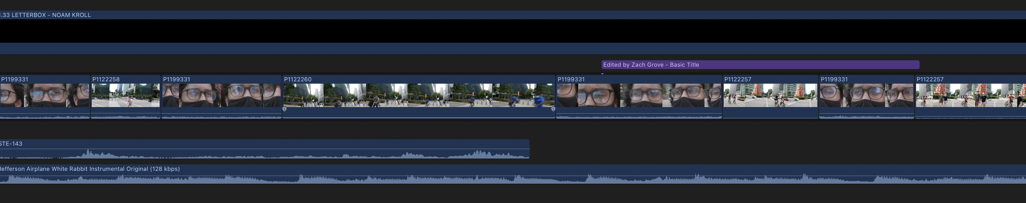
editing first draft

Today was my first editing day, I'm looking through all the clips and curating the best ones and ultimately working towards a rough cut.
Today I was adding sound of heavy breathing to my film to emphasise the fear my main character Casey has when he is freaking out about the people around him.

I'm currently working on colour correction as my clips are really bland currently and I need to try and make the scenery look nice and colourful as in my film the not so nicely coloured shots indicate the POV of my main character and clips that are beautifully coloured are how they actually are.
Before:


Feedback on Roughcut
Today in class we were given feedback on are film.
from my class I learnt that there were some issues with the clarity of the narrative, they found it was not obvious enough the the character Casey meets at the end is part of his delusion.
Teacher feedback:

I have now fixed this by editing the shot reverse shot to quickly witch between a shot with the character and the same shot without the character in it like it's flickering.
furthermore my class feels I should get more reaction shots to further emphasise the idea that Casey feels people are watching.
In my film my classmates liked the framing I decided to use, and also the use of snorricam which they felt was super effective in getting across how scared Casey truly is
Friday, March 18, 2022
reshoot
Final Shoot and final edit:


I have now added these clips in and gone through my final film to conclude the final edit, and the film is a lot better with them. Im very happy with my final product.
Experiments for my film
Tonal montage experiment for my film:
I am considering using the tonal montage technique in my film to communicate the feel of my film. furthermore, it is very good in creating tension in a film.
Here is me and my friend experimenting with the snorricam shot I plan to use in my film:
I used my brother to help me try a tracking shot that creates suspense:
Experiments with split lighting:

In psychological thrillers this technique is used to hint at a split personality or just general mental instability.
Thursday, March 17, 2022
Colour and lighting
in my opening I want to easily distinguish Casey's delusion and reality using colour, when it is his POV I want the colour to be desaturated and sickly, using colour like green and yellow and more contrast and when the shot is not in his POV the colours should be normal and ''pretty''
A fantastic example of the colours I would like to use for Caseys deluded POV can be seen in
(Fight club 2011)


making the colour for his delusion:


Footage of how we filmed with the lighting:

in regards to lighting I will be using split lighting which is commonly used in the phycological thriller genre to cannote an idea that a character has 2 realities, this can be seen in (shutter island 2010)
this will further reinforce to my audience that my character has an inaccurate idea of reality.
we did this on set using a light shining on one side running along with the actor:
enhancing the split lighting in editing:
Font research
For my font choice I was inspired by the following film credits


Analysis:
Each of the fonts used are very simple and Serious in tone so have a clear and simple typeface rather than anything distracting. Also The Joker and Shutter are period pieces that refer explicitly to the style of the films from the era they are set (70s for Joker, and the 50s for Shutter Island). Therefore the font was suitable for the time period and the credit style in that era. the use of a simple text can also help to make a piece timeless which is great when making a psychological thriller.
I used the site What the font to identify similar font choices


Subscribe to:
Comments (Atom)

-
 Final Shoot and final edit: Yesterday I went back to The Central business district to get some final clips, I wanted to get videos emphasis...
 -
In my film I have made the decision to make the template of my frame a 4:3 aspect ratio, I have done this to establish an idea of my charac...

